Skip to content
Jogiitech
← All work
Entertainment & Live EventsERPLive Entertainment, Artist Management, Venue ProgrammingLondon, United Kingdom · 4 weeks· 3 min read

PHNX Entertainment logo and brand system.

A phoenix mark drawn for a London live-entertainment company, then built out into a full identity system: colour, type, stationery, digital screens and written guidelines.

PHNX Entertainment · published with the client's permission

Services delivered

Brand IdentityLogo DesignVisual IdentityBrand GuidelinesArt DirectionEntertainment
PHNX Entertainment logo and brand system

01 / Background

PHNX Entertainment programmes live events, manages artists and partners with venues in the United Kingdom. The engagement began as a single deliverable, a logo, for a category where the visual language is either cheap neon or anonymous black-on-black. The mark had to carry the name itself: PHNX is an unpronounceable string until something in the artwork explains it. Once the mark was approved it was extended into a working system so the company could put the name on a poster, a door list, a ticket, an invoice and a site without redrawing anything.
02 / Challenges

A name that needs the mark to explain it

Read cold, PHNX is four consonants. The identity had to supply the missing vowels visually so a first-time reader arrives at phoenix without being told, and never has to see the full word spelled out.

One mark, two very different surfaces

Live entertainment lives on dark: stage screens, posters at night, black merchandise. Business lives on light: invoices, contracts, email. The same artwork had to hold on stage black and on paper without a second version.

Gradient artwork under real-world reproduction

The mark runs gold through to ember. Gradients are the first thing to fail in single-colour print, embroidery and small favicons, so the rules had to define where the gradient is allowed and where it is not.

A category that reads as either cheap or anonymous

Event branding tends to shout in neon or disappear into unbranded black. PHNX needed to read as a promoter with a standing roster, not a one-off club night.

Operational detail competing with the name

Door times, set times, ticket references and venue names are everywhere in this business. Left unstructured they crowd the identity on every poster and every listing.

03 / Solutions

01

A phoenix as the letter P

The rising bird resolves into the P of the wordmark, so the mark and the first letter are the same object. That single move makes the name legible: a reader completes PHNX as phoenix without a descriptor line doing the work.

02

Heat as the colour system, not decoration

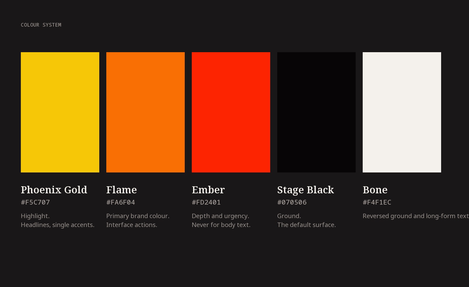
Three tones taken directly from the artwork: Phoenix Gold #F5C707 at the crown, Flame #FA6F04 through the body, Ember #FD2401 at the base, held on Stage Black #070506 with Bone #F4F1EC as the reversed ground. Flame is the only interface action colour. Ember is never used for body text.

03

Three typographic voices with one job each

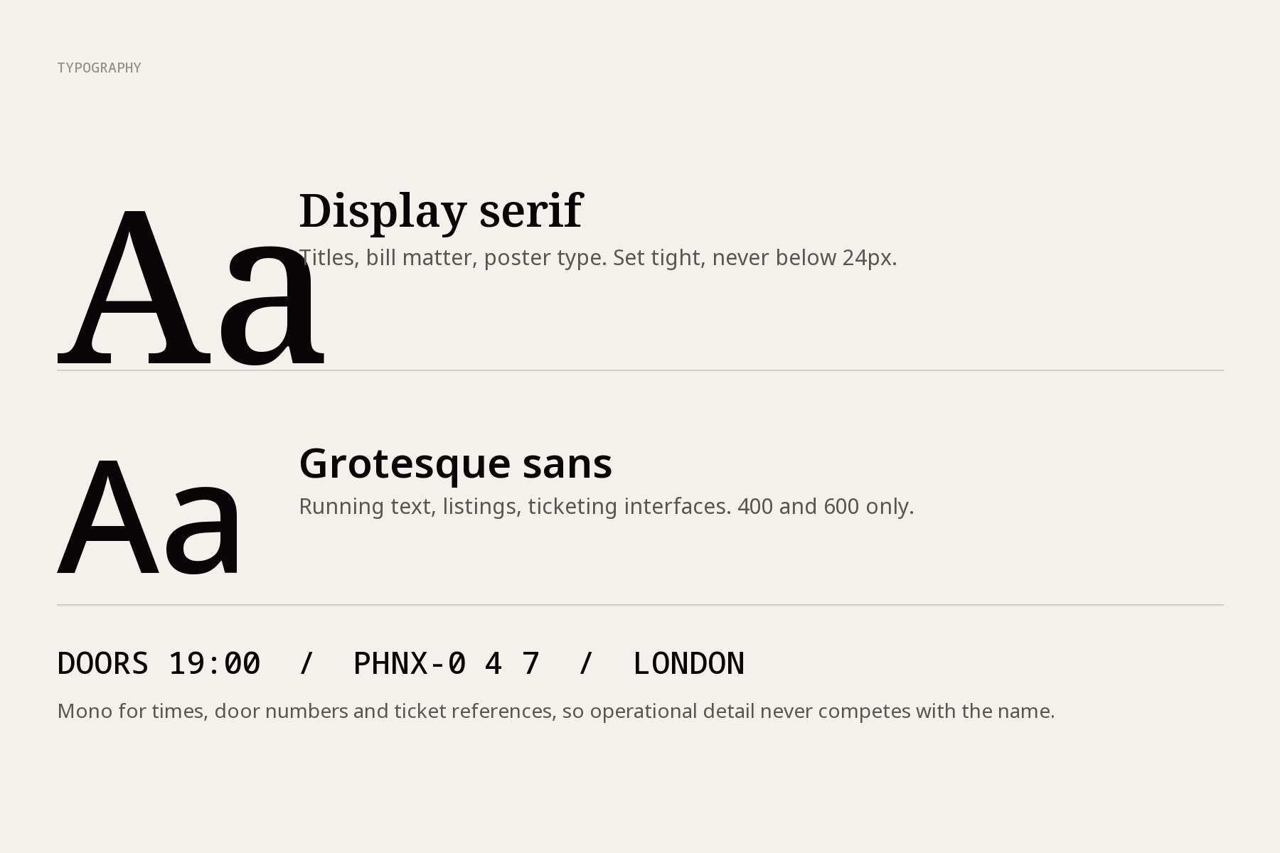
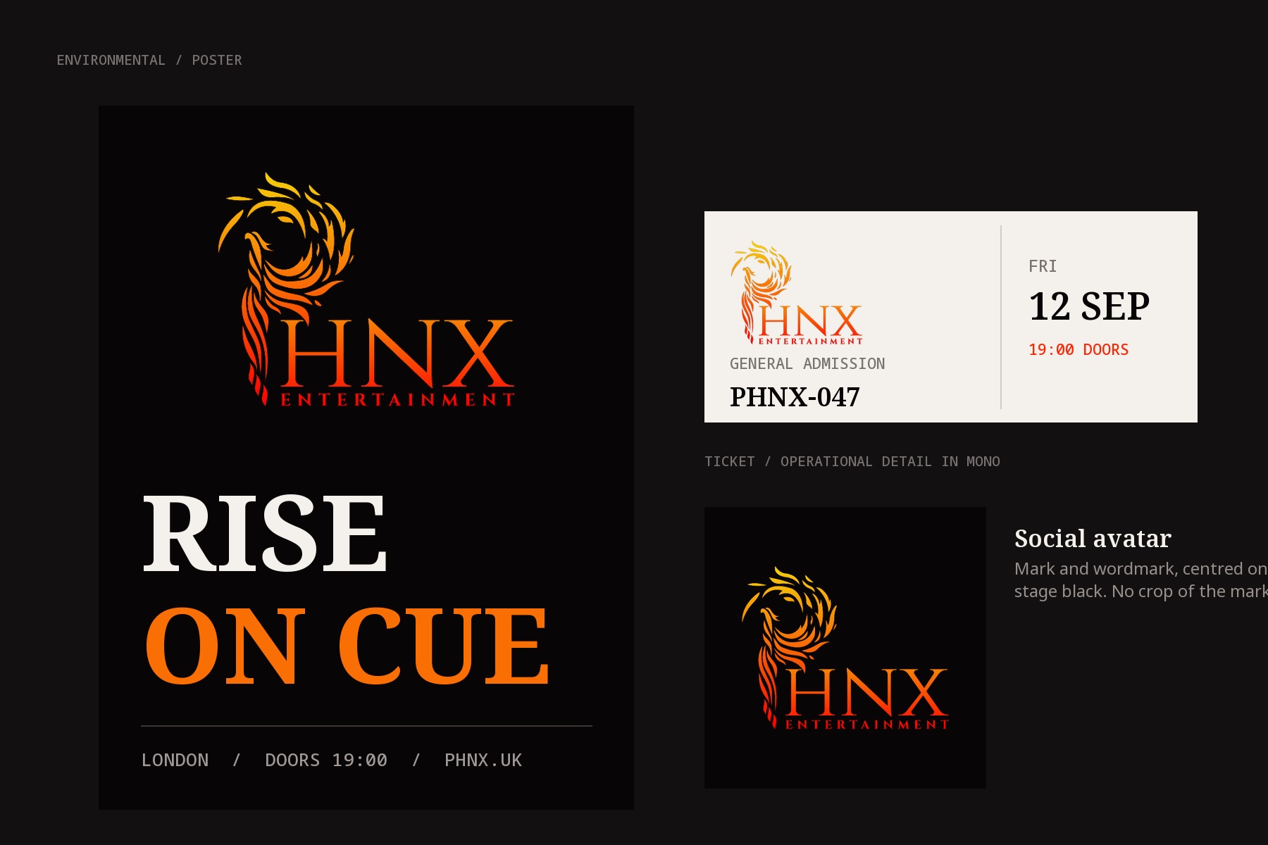
A display serif for titles and bill matter, a grotesque sans in two weights for running text and listings, and a mono reserved for times, door numbers and ticket references. Operational detail gets its own voice so it stops competing with the name.

04

Stationery designed as the light-ground proof

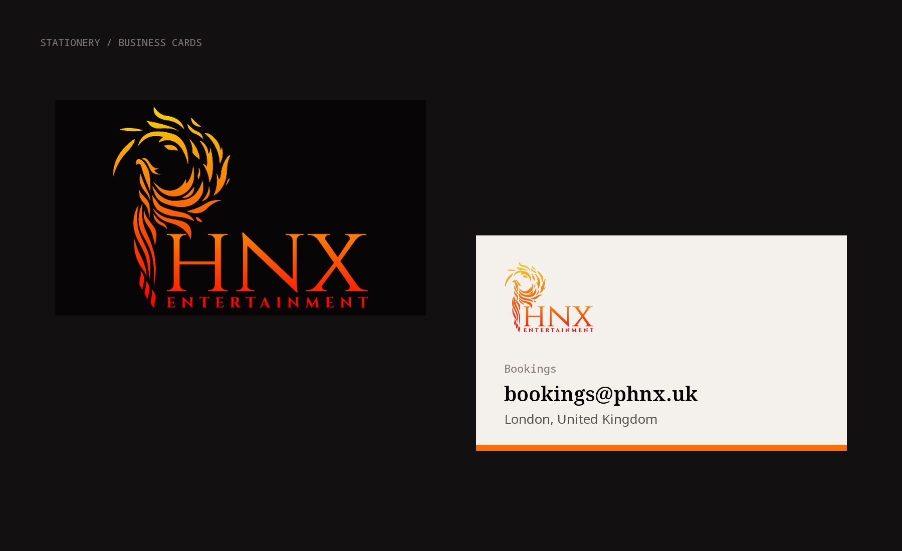
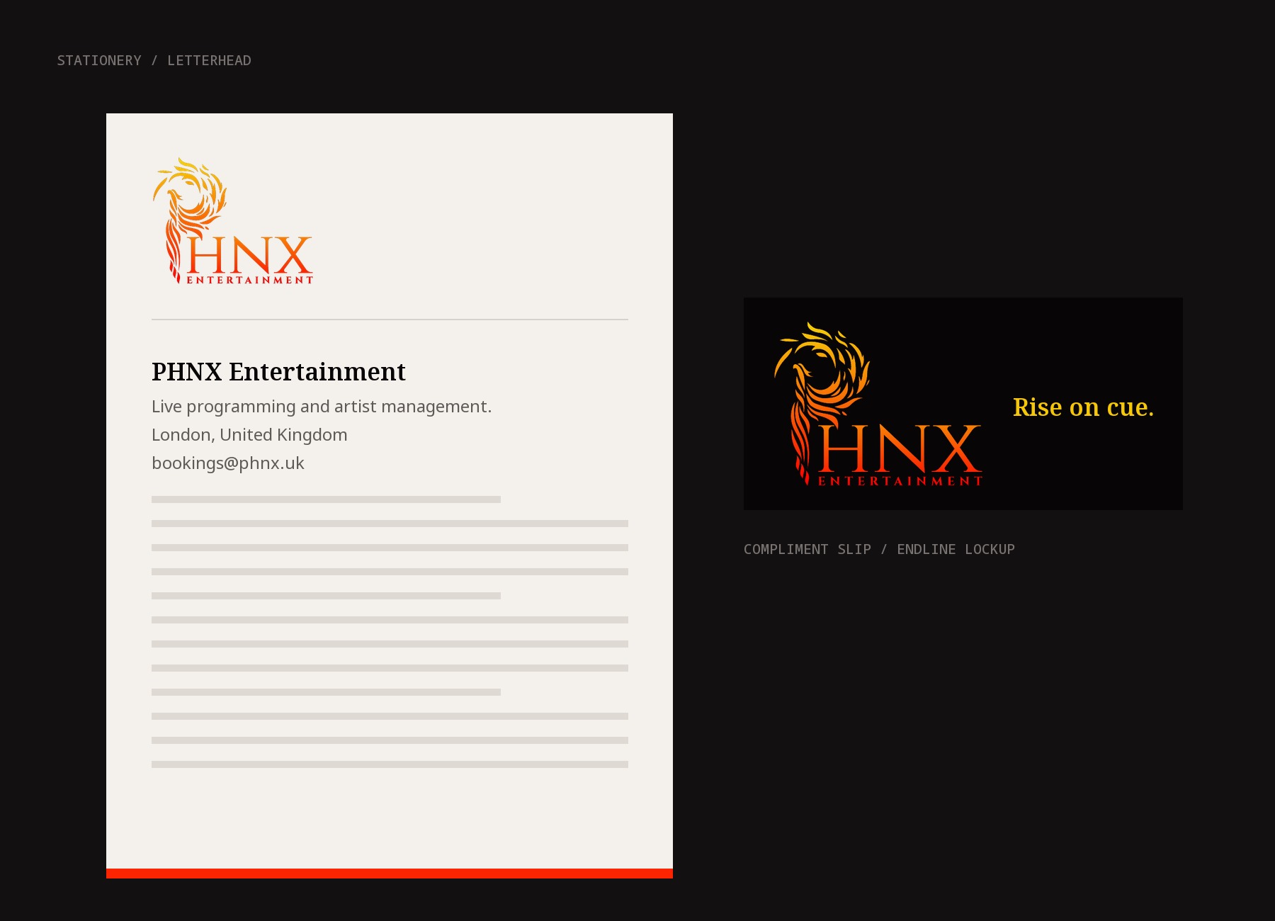
Business cards, letterhead and compliment slip were drawn before any screen work, because paper is where the gradient is hardest. The card pairs a black mark-forward face with a bone reverse, so the system is proven on both grounds in one artefact.

05

Digital screens built around what's on

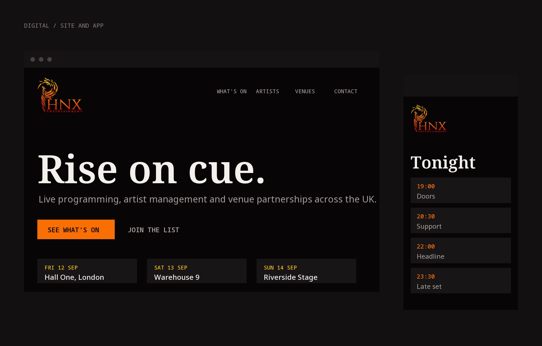
The site and app screens lead with the endline, then a dated listing pattern that repeats across desktop and mobile. Flame is used only for the primary action; everything else is black, bone and mono.

06

Written guidelines that constrain, not describe

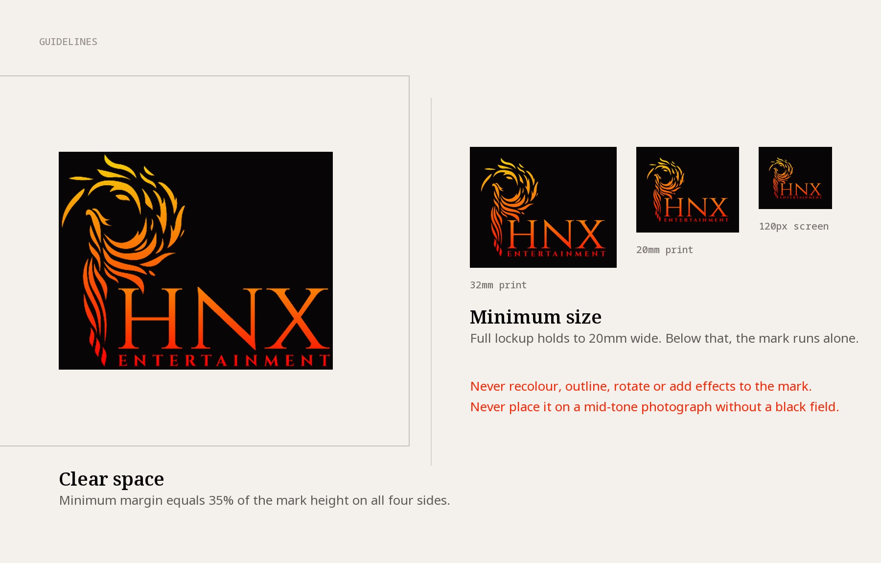
Clear space set at 35% of mark height, minimum full-lockup width of 20mm with a mark-only fallback below it, and explicit prohibitions: no recolouring, no outlining, no rotation, no effects, and no mid-tone photography without a black field behind the mark.

07

Applications proofed at the extremes

Poster, ticket and square social avatar were produced as the final proof, covering the largest and smallest reproductions the company uses in a normal week.

05 / Scope

Brand StrategyLogo DesignVisual Identity SystemColour SystemTypographyStationeryDigital UI DirectionBrand GuidelinesArt Direction

06 / Outcomes

→

The name reads on first contact

The mark carries the missing vowels, so the abbreviation stops being a barrier and the company can use the short form everywhere without a descriptor.

→

One artwork, both grounds

The same file is signed off for stage black and for bone paper, which removes the usual second round of small-size and light-ground redraws.

→

A system the client can run without us

Colour values, type roles, clear space, minimum sizes and misuse rules are written down, so posters, tickets and listings can be produced in-house and still land in the brand.

→

Separation from the category

Heat on black with disciplined mono detail puts PHNX in a different bracket to neon event flyers and unbranded black, which is what lets it be read as an established promoter.

Next case · 01

US plastic-recycling manufacturer (flakes to granules) →

A fully automated flakes-to-granules plant unified on Odoo Manufacturing - with photo-based QC and waste-tracking wired into the production line.…

US plastic-recycling manufacturer (flakes to granules)

Talk to the team about Entertainment & Live Events

A system like this,
for your business.